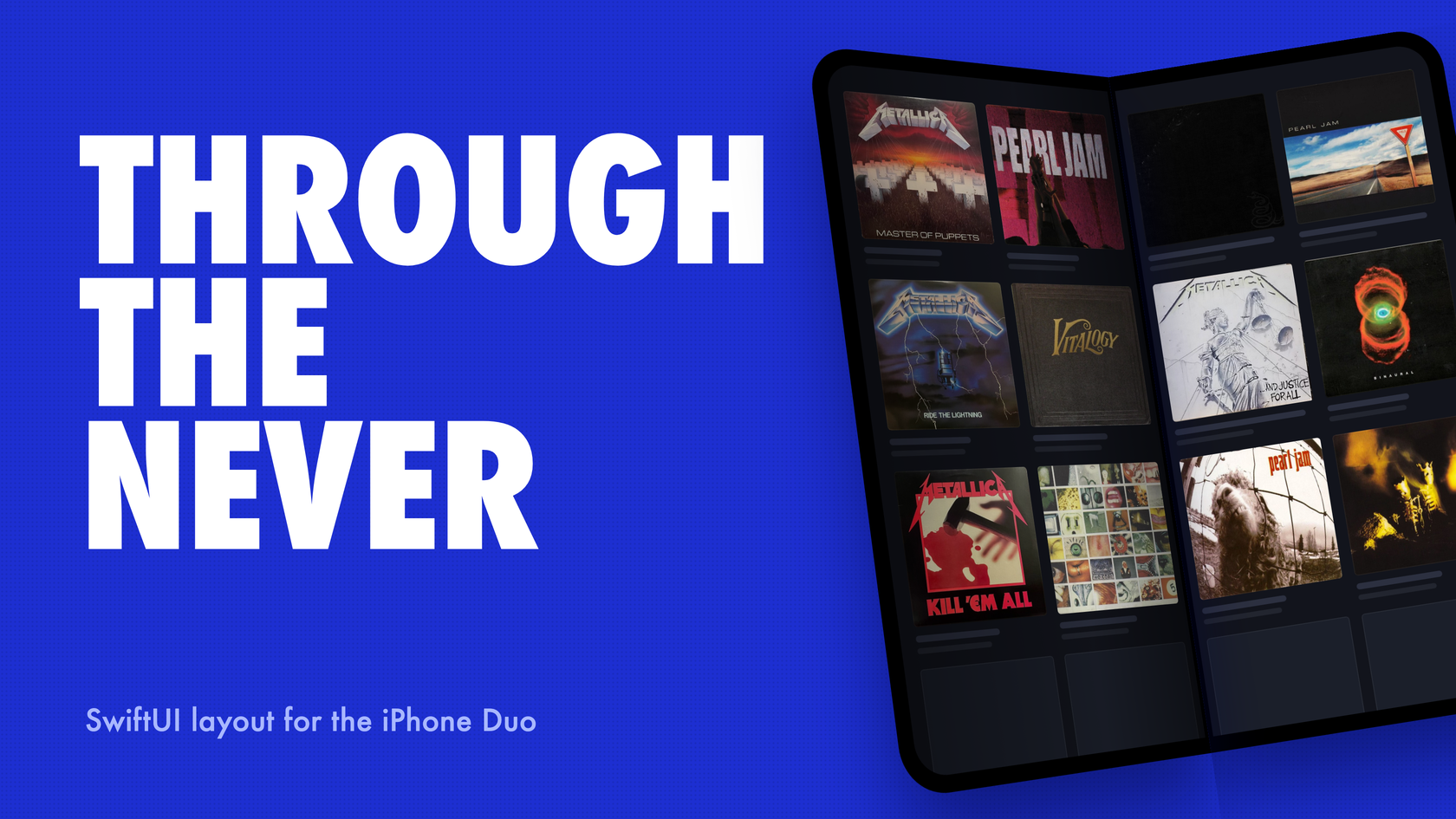
My app runs on a phone that folds. I have never held one.
Apple announced the iPhone Duo on September 9 — pre-orders October 16, in stores October 23, $1,999 to get in the door, riding on iOS 27.1. The closest I’ve gotten is the Duo simulator that landed with Xcode 27.1 beta on September 18: a 434-point outer display, a 669-point inner one, and no way to fold between them.
VinylCrate 4.1, the next release, supports Apple’s first foldable anyway. The inner display gets the sidebar layout, the grids know where the hinge is, and the camera follows whichever display you’re looking at. Getting there meant ripping out the SwiftUI layout model I taught on this blog six months ago. So that’s where this starts — with me eating a little crow.
Holier Than Thou — Correcting My March Adaptive Layout Post
In March I wrote a post about adaptive SwiftUI layout built around a five-case enum. Trimmed:
enum LayoutEnvironment {
    case iPhonePortrait
    case iPhoneLandscape
    case iPadFullscreen
    case iPadSplitView
    case iPadSlideOver

    var isIPad: Bool {
        switch self {
        case .iPadFullscreen, .iPadSplitView, .iPadSlideOver: return true
        default: return false
        }
    }
}
That post’s closing section was titled “Design for Context, Not Device.” Read the case names again. Every one of them is a device. I told you to stop asking “is this an iPad?” and then handed you an enum whose most important property was isIPad.
A reread turns up worse. .iPadSlideOver is declared, but the initializer in that post never returns it, so nothing ever produced that case. And the checklist at the bottom told you to test Slide Over, “which is narrower than any iPhone,” while the app the post was about was stranding people in Slide Over. More on that in a minute.
And the version I published was the flattering one. The enum actually in the repo skipped the size-class reasoning and went straight to the hardware:
init(horizontalSizeClass: UserInterfaceSizeClass?, verticalSizeClass: UserInterfaceSizeClass?) {
    let isIPad = UIDevice.current.userInterfaceIdiom == .pad

    switch (isIPad, horizontalSizeClass, verticalSizeClass) {
    case (true, .regular, .regular):
        self = .iPadLandscape
    case (true, .compact, .regular):
        // iPad with compact horizontal size class means split view
        self = .iPadSplitView
    case (true, _, _):
        self = .iPadPortrait
    case (false, _, .compact):
        self = .iPhoneLandscape
    default:
        self = .iPhonePortrait
    }
}
The instinct in that post was right. Size classes alone are too coarse, and one branch at the root beats forty scattered through the views. The model was wrong, in both the published version and the shipped one. Each answered “what device is this?” with extra steps, and that question stops having an answer once one device can be two sizes. PR #5 deleted the shipped one. If you built something from the published one, consider this the correction.
The God That Failed — Why userInterfaceIdiom Breaks on the iPhone Duo
Unfolded, the Duo’s inner display is 669 by 951 points and reports regular width and regular height, the same pair a full-screen iPad reports. userInterfaceIdiom is .phone on both displays.
VinylCrate’s old classifier, the init above, asked the idiom first, and its phone branch never looked at the horizontal size class. On the inner display it would have drawn the phone layout: a two-column grid under a bottom tab bar, on a screen as wide as a small iPad, while a fully built NavigationSplitView sat unused in the same file.
Nothing about that fails loudly — no crash, no log line, and every test keyed to device names stays green. It just draws the wrong app.
The idiom was never a good layout signal, even before the Duo. iPad Slide Over reports .pad at roughly 320 points. An iPad app on an Apple silicon Mac reports .pad too. The Duo is just the case you can’t talk your way around.
So the idiom is gone. userInterfaceIdiom, isIPad, and isIPhone don’t appear anywhere in the app target now, and the platform doc says to keep it that way. Every layout question the app asks comes down to three things: the width class, the width of this container, and whether there’s a hinge.
Escape — The iPad Slide Over Dead End
Here’s the gut punch: the Duo forced the rewrite, and the rewrite turned up a bug I’d already shipped.
The old model classified iPad Slide Over as .iPadSplitView, and isIPad sent every iPad case to the sidebar layout. So a pane about 320 points wide rendered a NavigationSplitView, and at compact width a split view collapses to its detail column. In that branch the sidebar was the only way to switch tabs, and there was no tab bar. Anyone who slid VinylCrate over was stuck on whichever tab they had open. The only way out was to close the app.
The fix isn’t a Slide Over special case. Nothing in the new code even mentions Slide Over — a narrow pane is compact, compact gets tabs, done.
It wasn’t free, and the changelog says so. Dragging an album onto a crate used to work in Slide Over; now narrow panes get the phone layout and its tap-to-pick crate sheet. I’d make that trade again every time. Still a trade.
Fixxxer — Column Counts From Measured Width
LayoutEnvironment kept its name. It’s a struct now, trimmed here to the parts that matter:
nonisolated struct LayoutEnvironment: Equatable, Sendable {
    enum WidthClass: Equatable, Sendable {
        case compact
        case regular
    }

    struct Division: Equatable, Sendable {
        let thickness: CGFloat
    }

    let widthClass: WidthClass
    let containerWidth: CGFloat
    let division: Division?

    var usesSidebarNavigation: Bool {
        widthClass == .regular
    }

    static func widthClass(
        horizontal: UserInterfaceSizeClass?,
        vertical: UserInterfaceSizeClass?
    ) -> WidthClass {
        horizontal == .regular && vertical != .compact ? .regular : .compact
    }
}
division is the hinge, and it gets its own section below. widthClass(horizontal:vertical:) is the one place the root reads size classes, and it adds one rule: regular width with compact height gets demoted to compact. A Max iPhone in landscape is wide enough for a sidebar and too short to open one.
It’s easy to overcorrect here, so to be clear: the root navigation decision still comes from size classes. Size classes were never the problem. A size class is the system telling you how much room you have; isIPad is you guessing at the room from the hardware. Only one of those stays right when the hardware folds.
Grids are where the numbers come in. Each grid has a role (the collection, the art wall, the insights summary), and each role has a target tile width and a column range. The column count is a pure function of measured width:
private static func columnCount(
    for width: CGFloat,
    metrics: ResponsiveGridMetrics,
    spacing: CGFloat,
    environment: LayoutEnvironment
) -> Int {
    let range = metrics.columnRange
    guard width.isFinite, width > 0 else { return range.lowerBound }

    let ideal = min((width + spacing) / (metrics.targetTileWidth + spacing), CGFloat(range.upperBound))
    let clamped = max(Int(ideal.rounded()), range.lowerBound)
    guard environment.prefersEvenColumnCount, !clamped.isMultiple(of: 2) else { return clamped }

    if clamped + 1 <= range.upperBound { return clamped + 1 }
    if clamped - 1 >= range.lowerBound { return clamped - 1 }
    return clamped
}
The collection grid aims for 170-point tiles, two to six columns. The art wall aims for 74, four to twelve, with no spacing at all. There’s no device name anywhere in that function. The Duo’s 434-point outer display gets two columns because two 170-point tiles fit in 434 points — nobody had to teach the code what a Duo is. And the same math quietly fixed iPhone landscape: the collection grid used to sit at three columns sideways, and now it fits four or five depending on the phone.
The width a grid measures has to be its own. These grids live in split-view detail panes and inside sheets, which are both much narrower than the window, so ResponsiveGrid measures itself:
struct ResponsiveGrid<Content: View>: View {
    let role: ResponsiveGridRole
    @ViewBuilder var content: () -> Content

    var body: some View {
        LazyVGrid(columns: configuration.gridItems, spacing: configuration.spacing) {
            content()
        }
        .onGeometryChange(for: CGFloat.self) { proxy in
            // Whole points only: this width feeds ~30 views and would otherwise thrash on
            // every sub-pixel step of an interactive resize.
            proxy.size.width.rounded()
        } action: { width in
            measuredWidth = width
        }
    }

    @Environment(\.layoutEnvironment) private var layoutEnvironment
    @State private var measuredWidth: CGFloat?

    private var configuration: ResponsiveGridConfiguration {
        ResponsiveGridConfiguration.resolve(
            role: role,
            width: measuredWidth ?? layoutEnvironment.containerWidth,
            environment: layoutEnvironment
        )
    }
}
That rounding is load-bearing. onGeometryChange fires whenever the value changes, and an interactive resize nudges the width by fractions of a point every frame. Round to whole points and none of that churn reaches the thirty-odd views downstream.
It also has a flaw. Until the first geometry callback, the grid seeds from layoutEnvironment.containerWidth, and that’s the root’s width, not the pane’s.
In the sidebar layout the root measures the whole window while the grid lives in the narrower detail pane, so the first frame can come out one column too many and then snap back. I kept it on purpose. Without the seed, the first frame sits at the column floor. Removing it also means removing the root geometry reader, which is a design change that deserves its own review. For now it’s parked as a documented follow-up. I can live with one frame of wrong.
The root itself is split into two views:
struct AdaptiveRootView: View {
    let container: ViewModelContainer
    let oauthService: OAuthService

    var body: some View {
        AdaptiveRootContent(container: container, oauthService: oauthService)
            .withAdaptiveLayout()
    }
}

// A view cannot read an environment value it sets in the same body — hence the split.
private struct AdaptiveRootContent: View {
    @Environment(\.layoutEnvironment) private var layoutEnvironment

    var body: some View {
        Group {
            if layoutEnvironment.usesSidebarNavigation {
                sidebarLayout
            } else {
                tabBarLayout
            }
        }
        // The system animates the fold itself; a second cross-fade underneath reads as a glitch.
        .transaction(value: layoutEnvironment.usesSidebarNavigation) { $0.animation = nil }
    }
}
The first comment is a SwiftUI rule that bites everybody exactly once: an environment value you set applies to what you wrap, not to the body doing the setting. The second is a judgment call on a transition I’ve reasoned through but never actually watched on hardware. When the phone opens, the system is already animating — cross-fade the tab bar into the sidebar underneath it and you’ve got two animations fighting over one gesture.
Broken, Beat & Scarred — Reading the Hinge From Reserved Regions
The inner display has a hinge down the middle, and it doesn’t show up as a safe-area inset. In iOS 27.1, UIKit describes it as a reserved region: reservedRegions(kind: .division, options:), called on a view. SwiftUI has no equivalent. That’s the half of the Duo API Xcode 27.1 left out of SwiftUI. The hinge is there — you just have to go through UIKit and a representable to reach it.
VinylCrate’s probe is a UIView that ignores touches, placed in the root’s .background by the same modifier that publishes the layout environment:
@available(iOS 27.1, *)
private final class DivisionProbeView: UIView {
    var onChange: ((LayoutEnvironment.Division) -> Void)?

    // Reserved regions have no change notification, so layout is the only hook.
    override func layoutSubviews() {
        super.layoutSubviews()
        // A windowless or empty pass queries nothing, and a hinge must never be retracted.
        guard window != nil, !bounds.isEmpty else { return }

        if let division = currentDivision() {
            publish(division)
        }
    }

    private var published: LayoutEnvironment.Division?

    // `.includeInactive` makes the hinge a property of the device, not the pose: columns cannot reflow mid-fold.
    private func currentDivision() -> LayoutEnvironment.Division? {
        guard let region = reservedRegions(kind: .division, options: .includeInactive).first else {
            return nil
        }
        return ReservedRegionSupport.division(regionFrame: region.frame)
    }

    // Deferred by a hop: this runs inside a UIKit layout pass and the handler writes SwiftUI state.
    private func publish(_ division: LayoutEnvironment.Division) {
        guard published != division else { return }
        published = division
        let handler = onChange
        Task { @MainActor in handler?(division) }
    }
}
There are four decisions packed into that little view.
layoutSubviews, because there’s nothing else to hook. Reserved regions have no notification and no trait. If the region changes, the view lays out, and that’s when you ask.
.includeInactive makes the hinge a property of the device instead of the pose. Without it, the region would come and go as the phone opens and closes, and every grid would reflow while the fold was still moving. With it, the app decides the column count once and it holds while the hardware moves.
A hinge is never retracted. If currentDivision() returns nil, nothing gets published. Once the app knows there’s a hinge, it stays known — same stability argument, other direction.
The publish is deferred through a Task { @MainActor in } hop. This code runs inside a UIKit layout pass, and the handler writes SwiftUI @State. Writing state from inside someone else’s layout pass is how you end up with re-entrant layout.
ReservedRegionSupport.division(regionFrame:) turns the frame into a thickness. It only counts the minor dimension, because the strip’s orientation follows the pose. It rounds to whole points and caps the result at 24, so a malformed region can’t collapse a grid. It also rejects CGRect.infinite, which reports greatestFiniteMagnitude extents that an isFinite check alone won’t catch. This is the app’s only #available(iOS 27.1, *) gate in the layout system, and a custom SwiftLint rule, single_reserved_region_gate, fails the build if reservedRegions( shows up anywhere else.
What the grids do with the hinge is small on purpose. A hinged display gets an even column count, so the hinge never runs down the middle of an album cover. The gutters also get a bonus equal to the hinge’s thickness. In the Duo’s 621-point inner pane, a 12-point hinge brings the collection grid’s spacing to 32. That works out to about 3.2 columns, which rounds to three and then bumps to four.
The art wall opts out of the gutter bonus:
case .artWall:
    // Zero spacing is the point: the wall reads as one continuous surface, not a grid
    // of cards, so the hinge gutter bonus does not apply here.
It still gets the even count — just not the wider gutter.
The Judas Kiss — Testing Widths Instead of Device Names
The old art wall test was ArtWallGridConfigurationTests, and its expected values were a table of device names:
(.iPhonePortrait, 5), (.iPhoneLandscape, 8), (.iPadPortrait, 8), (.iPadLandscape, 10), (.iPadSplitView, 6)
It was green, and it had nothing to say about a device it had never heard of. You can’t add the Duo to that table without first deciding which existing case the Duo “is,” and making that decision was the bug. A test keyed to device names can only confirm that the classifier agrees with itself.
The replacement is a Swift Testing suite, ResponsiveGridConfigurationTests. It keeps a few anchors, because a person should be able to read “this width gets this many columns” and agree. The device names moved into comments, where they describe the width instead of deciding the result:
let anchors = [
    Anchor(width: 361, widthClass: .compact, division: nil, expected: 2), // iPhone 17 Pro portrait
    Anchor(width: 434, widthClass: .compact, division: nil, expected: 2), // Duo outer display
    // Duo inner display, detail pane — hinged, so the odd count rounds up to even
    Anchor(width: 621, widthClass: .regular, division: Self.hinge, expected: 4),
    Anchor(width: 506, widthClass: .regular, division: nil, expected: 3), // iPad 11" portrait pane
    Anchor(width: 890, widthClass: .regular, division: nil, expected: 5) // iPad 13" landscape pane
]
Most of the checking happens in the sweeps. They cover every width from 280 to 1400 points, in both width classes, with and without a hinge, and check properties that have to hold everywhere:
@Test("a hinged display gets an even column count")
func hingedDisplaysGetEvenColumns() {
    for environment in Self.sweep(division: Self.hinge) {
        for role in [ResponsiveGridRole.collection, .artWall] {
            let config = Self.configuration(role, in: environment)
            #expect(config.columns.isMultiple(of: 2), "\(role) at \(environment.containerWidth)pt")
        }
    }
}
The other sweeps check that every role stays inside its column range, that the art wall is denser than the card grid at every width, that art wall tiles never drop below the 44-point tap target, and that the wall keeps zero gutters with or without a hinge. None of them names a device, which is exactly why they’ll still mean something when Apple ships the next weird rectangle.
Degenerate widths get their own test, and its doc comment makes the whole case:
/// `Int(CGFloat.nan)` traps, and a zero-size first layout pass is routine.
@Test("degenerate widths resolve without trapping")
func degenerateWidthsAreSafe() {
    let environment = LayoutEnvironment(widthClass: .regular, containerWidth: 0)

    for role in Self.allRoles {
        for width in [CGFloat(0), -1, -640, .nan, .infinity, -.infinity] {
            let config = ResponsiveGridConfiguration.resolve(role: role, width: width, environment: environment)
            #expect(config.columns == role.metrics.columnRange.lowerBound, "\(role) at width \(width)")
        }
    }
}
That’s why columnCount opens with guard width.isFinite, width > 0. A grid that measures itself sees zero before it sees anything real, and Int(ideal.rounded()) on a NaN crashes the app. Not a weird layout — a crash.
Two smaller suites cover the rest. LayoutEnvironmentTests maps each size-class pair to a root navigation choice, and one of those pairs is (nil, nil), the state where nothing has been published yet. ReservedRegionSupportTests feeds the hinge parser book, tabletop, and near-square poses. It also feeds it empty frames, infinite frames, a negative extent, and a region far too thick to be a hinge, and pins down what each one resolves to.
Room of Mirrors — A Camera That Follows the Display
Layout wasn’t the only place where “the device” turned out to be the wrong unit. On a foldable, “back camera” changes meaning when the phone opens. The lens facing away from you on the outer display isn’t the one facing away from you on the inner display.
Dead Wax Scan reads the etchings in a record’s runout groove with the same on-device OCR pipeline as the sleeve scanner, and it has to keep pointing at the record through a fold. iOS 27.1 adds AVCaptureDeviceDirectionCoordinator for this. You give it the preview’s view, and it reports which cameras face away from the display that view is on:
coordinator = AVCaptureDeviceDirectionCoordinator(
    view: view,
    deviceTypes: CaptureDirection.preferredDeviceTypes,
    changeHandler: { [weak self] map in
        self?.handle(map.backwardFacingDeviceDescriptors.map(CaptureDeviceDescription.init))
    }
)
Two details will bite you. First, deviceDirections is empty until the first callback fires, so nothing can be resolved during setup. Capture starts on a fixed rear camera (dual-wide, then wide-angle) and swaps when a callback names a different one. Second, a swap that can’t complete leaves the previous input in place. replaceInput reports .swapped, .restoredPrevious, or .lostInput, because a fold is exactly when the old input might stop working too. Only .lostInput moves the scanner to .unavailable. A coordinator that isn’t available never means there’s no camera.
My favorite bug of the whole project lived here. The preview view connects to the camera controller through CameraPreviewHost, and attachPreviewView(_:) and detachPreviewView() used to have no-op defaults in a protocol extension. When My Photos got its own in-app camera, its controller inherited those defaults without anyone noticing. It compiled, it ran, and on a real Duo, folding the phone mid-capture would have left that viewfinder pointed at the user. Nobody saw it happen — there was nothing to fold. It surfaced the old-fashioned way, by reading the code.
The fix was deleting the defaults:
@MainActor
protocol CameraPreviewHost: AnyObject {
    var session: AVCaptureSession { get }
    func attachPreviewLayer(_ layer: AVCaptureVideoPreviewLayer)
    // Deliberately undefaulted: a no-op default silently denies a conformer the fold-aware
    // camera swap, which is how My Photos shipped pointing at the user after a fold.
    func attachPreviewView(_ view: UIView)
    func detachPreviewView()
    func previewLayoutDidChange()
    func focus(atDevicePoint point: CGPoint)
}
Now, leaving out either hook is a build error. A default in a protocol extension is a decision made for every future conformer, and a no-op is the quietest decision there is. Both camera screens now share a CaptureSessionRunner that owns the session, interruption handling, and the fold-aware swap, so the next fix only has to land in one place.
The outer display gets a job too. While you scan on the inner display, the outer one shows the side being read, the running etching count, and the last line found. It’s built from CameraCaptureAccessory (27.1) inside sceneAccessory (27.0), and the gate is 27.1 because the accessory is the only content. A 27.0 gate would register an accessory that draws nothing. It also shows no preview frames on purpose: the scan’s guide ring maps to OCR under one preview gravity, and a second preview surface would split that mapping in two.
Dream No More — The Code That Has Never Run
Now the uncomfortable part.
The PR #5 description says it plainly: “All iOS 27.1 paths — reserved regions, direction coordinator, outer-display accessory — have never executed, because no simulator fold control exists.”
The Xcode 27.1 simulator gives you a Duo, but you can’t fold it. So the hinge probe, the direction coordinator, and the outer-display accessory have compiled, passed review, and been reasoned through carefully, and none of them has ever run against a fold. The tests cover everything around them: the thickness parser, the column math, the camera preference order, the swap bookkeeping. Those are the pure parts. The places where the system hands me something are exactly the parts I can’t run.
There’s a reason this post borrowed Through the Never for its title — a chunk of this code lives past the edge of anything I’ve been able to watch run. That’s what “before the device exists” means in practice. I didn’t find an abstraction that makes hardware irrelevant. I have a set of pure functions I trust, wrapped around a few system calls I’ve read the headers for and never seen fire. The repo’s docs have a device QA checklist sitting there, waiting on real hardware.
I’m comfortable shipping it this way because every 27.1 path fails toward behavior that’s already tested. If no hinge is ever published, there’s no even-column rule and no gutter bonus, and you get the same grids that already work on every iPad. If the direction map stays empty, the camera stays on the lens it started with. If the accessory never becomes available, the outer display doesn’t show it. In each case, the worst outcome is the app I’d have shipped without that code.
That’s the rule I’d hand anyone writing code they can’t run: when the untested path fails, make it fail into the tested one.
Creeping Death — A Checklist Before October 23
You can do all of this today with Xcode 27.1 beta and no hardware.
Find every device question:
grep -rnE 'userInterfaceIdiom|isIPad|isIPhone' --include='*.swift' .
Any hit that feeds a layout decision is a bug on the Duo’s inner display, which reports .phone and is as wide as an iPad. Replace it with a width class, a measured width, or a hinge check.
Put your iPad app in Slide Over and try to change tabs. If your regular-width branch keys off the idiom, a 320-point pane gets a split view that collapses to its detail column, and your only navigation disappears with the sidebar.
Make grids measure their own container with onGeometryChange, rounded to whole points. The window’s width is wrong inside a split-view detail pane, and it’s wrong inside a sheet.
Read the hinge from reservedRegions(kind: .division, options: .includeInactive) behind a single #available(iOS 27.1, *) gate. Do it in a UIViewRepresentable, from layoutSubviews, and publish the result on a deferred hop. Then decide what a hinge means for your grids. An even column count is a good default.
Replace device-named test tables with widths and properties. Keep a few labeled anchors for the humans, sweep everything else, and include NaN and zero.
If your app uses the camera, open a capture flow on the outer display and work out what “back” means once the phone opens. While you’re in there, look for protocol extension defaults on anything the camera depends on.
October 23 is when I find out how much of this I got right. Until then, the app knows more about the Duo than I do — and everything it knows, it learned by measuring.
Keep shipping.